olivermak.es a pretty website.

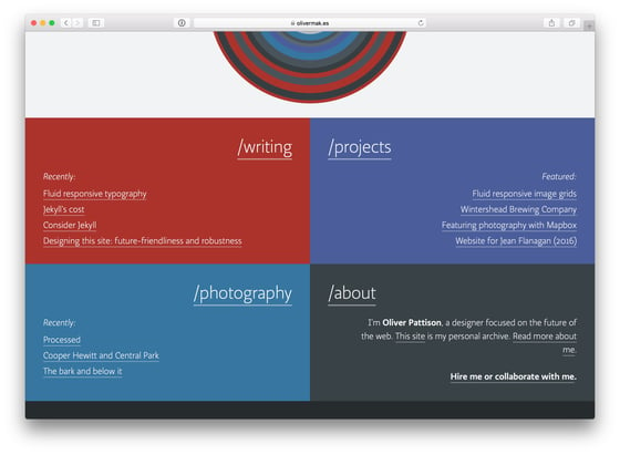
the home page of Oliver Pattison’s website image licensed CC BY-NC 4.0
Note: Oliver has dramatically simplified his website and removed a lot of content from it since I originally published this. All links here are to an archived version of the website I was seeing when I wrote this article.
A few days ago, I started trying to fix a problem where my footnote backlinks1 rendered as emoji on iPhones2, herein referred to as my “emoji problem.” Originally, I believed that I would have to write a Jekyll plugin to fix it; it turned out to be much easier to fix than that.
As I started monkeying around with custom plugins, nothing was happening on the site. Simple plugin code didn’t seem to load, and third-party plugins that I copied into my _plugins folder weren’t doing anything. It was as though the _plugins folder wasn’t working at all.
Eventually, I realized that was the exactly problem; GitHub doesn’t let you use plugins through the _plugins folder for security reasons, so my local machine wasn’t allowing it either.3
Abandoning an attempt at a custom solution, I looked at Jekyll’s list of available plugins that I could use with GitHub Pages. It turns out there are many useful plugins that enabled features besides the one I was seeking, so I decided to browse them.
While browsing fun plugins, I ran into a comment about about using CSS to change the appearance of footnotes. I thought it’d be worth a peak to see the commenter’s example code in use, so I clicked.
That is how I found Oliver Pattison.
falling in love
I initially clicked on a link to one of Pattison’s blog posts to see one small example, but I ended up browsing his whole website and writing this reflection.
Oliver Pattison describes himself as “a designer focused on the future of the web.”4 His competence as a designer was obvious to me as I browsed his work.
One of the first featues I noticed on Pattison’s website put me back on track to attempting to fix my original emoji problem.
Pattison uses the ⌅ character for his footnote backlinks, which struck me as a better alternative to the ↩︎ character I was using.5 It turns out he changed this behavior using a kramdown option that I had no idea existed, so I quickly added it to my site’s _config.yml6 and looked at the list of other options I could be using. (I didn’t end up using any others.)
This all made me feel like I was missing out epicly on many functionalities that my website should be implementing, so I browsed olivermak.es to see what other notes I could take from Pattison’s expertise.
With each new page I visited on his website, I felt that there was immense room for improvement on my website.
the heart beats faster
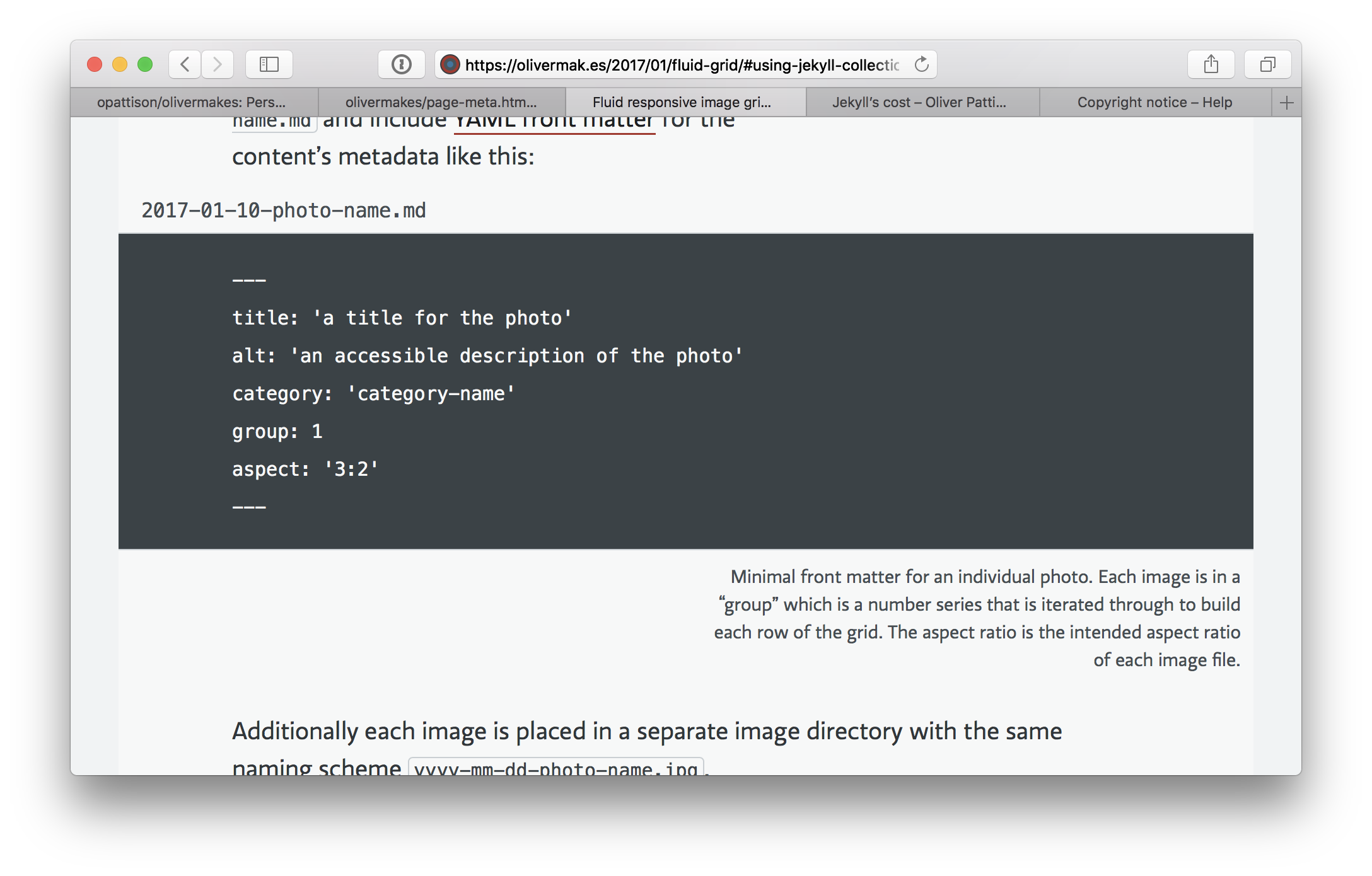
As I browsed Pattison’s website, I was looking for display elements that might be useful to bring to my website. One element that struck me was a caption he had on a block of code.

An example of Pattison’s use of captions. See this example on his website here. The caption on the code block element shown here is right-aligned to differentiate the text it contains from the body text. (Oliver Pattison, CC BY-NC 4.0)
As it turns out, it wasn’t just the nice styling that impressed me; the programming behind this captioned element also struck me.
better include patterns
Here’s a code snippet that illustrates how Pattison captions elements:
{% capture code %}
~~~ java
System.out.println("I hate Java.");
~~~
{% endcapture %}

{% capture caption %}
the honest truth about my feelings
{% endcapture %}

{% include block/code.html %}
The equivalent element on my site renders as:
System.out.println("I hate Java.");
the honest truth about my feelings
Pattison uses capture tags7 here to set two variables that are then rendered by the block/code.html element that he includes at the end.
This patterns looks useful because it enables the creation of custom templates in posts, but it also looks elegant because it allows the programmer to very easily author rich elements; it seems as though the content of the enriching template can be written right inside the post’s Markdown file as you write the post.
However, after implementing this pattern myself, I found that, in certain common cases, it was not as elegant as it first seemed. For example, if I want to include a link reference inside the caption text, I have to put the link definition within the capture tag rather than at the end of the Markdown document, as is my habit.
This will likely be an annoying interruption in an already established writing pattern I have developed, but I suppose it will get better with time.
if you love it, let it go
After taking note of other changes I could (and should) make to my website, I concluded I would have to eventually fix the organization of my .scss files, create a favicon, and set up an RSS feed for the blog.
However, with all of these notes down, I was beginning to realize that my initial thought looking at Pattison’s website—that I would need to make serious changes to my site after seeing his—was hyperbolic in nature. Pattison’s website is beautiful, but mine doesn’t need to look like his.
the frustrations of debugging
One of the frustrating aspects of reading through the HTML on Pattison’s site was figuring out where certain elements were generated. Because Jekyll allows you to do element rendering pretty much wherever you want, you can organize your _includes and _layouts directories to be as atomic as you would like.
I tend to prefer high verbosity in code structuring, meaning I tend to use many substructures, subclasses, subprocesses, and files in my projects. This has many advantages, all in the name of making code self-documenting and maintainable. However, in a narrow sense, having more files in a project can make certain tasks harder.
One example of such a task is narrowing down how a given element in a webpage is generated by a static site generator. This is a task that is made harder if the site generator does not generate documentation or comments in the final products (namely the CSS and HTML files), as is the default case with Jekyll. Site generators like Jekyll and other web serving tools even support minimizing the degree to which generated files are human-readable (i.e. “uglifying code”) for the sake of decreasing file sizes.
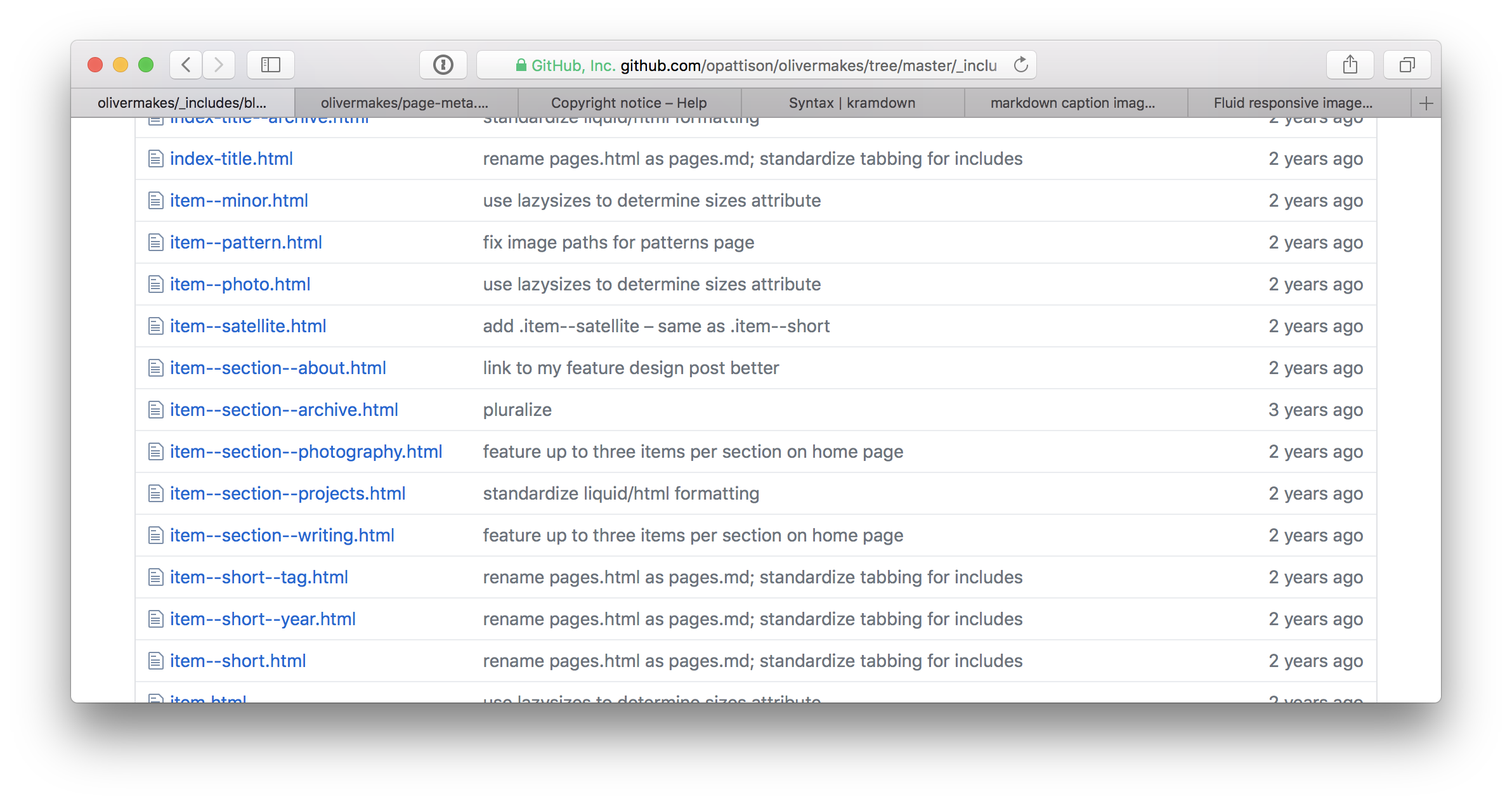
This means that, as I was attempting to figure out how Pattison was generating certain elements (e.g. links to each of his posts’ Markdown source files on GitHub), I had to do a lot of inferring. I had to make guesses at where the relevant rendering code might be based on how the template for the specific page was rendered, what the element’s name might be in the source, and how Pattison structured his _includes directory.

This is a screenshot of one subdirectory of Pattison’s _includes folder. Imagine sorting through this list of elements without the help of HTML comments as you attempt to debug the rendering of a webpage. (Oliver Pattison, MIT)
Of course, this was a pretty minor problem for the moment because Pattison’s website is not too big, but it struck me as a scalability issue. Imagine managing a larger static site with hundreds or thousands of layout files. Finding an error in any individual file is going to be hard no matter what, but without the guidance of generated HTML comments or other kinds of documentation, it’s the kind of task that gets harder disproportionate to the size of the project.
While there are downsides to over-optimizing for particular traits, including scalability, I view opportunities to create scalable workflows and structures as vital to pursue. Even if it does not noticeably improve the project itself, it can at least serve to improve my programming skills and knowledge in the domain.
Because it would be good practice and make my site at least a bit easier to debug, this experience inspired me to start looking into ways to have Jekyll generate HTML comments providing guidance on where certain elements on the page are being rendered.
I probably wouldn’t include this feature in the production code because it would only serve to increase load times for pages, but it would be helpful in the development environment.
we have different stylistic sensibilities and needs
Browsing Pattison’s site made me appreciate both his use of richly saturated colors and my use of pastels. This was one of many elements that struck me as very different between our site’s designs, and made me appreciate that I don’t need to make the same design choices that Pattison makes!
I strive for maximum writing quality on my site, and I focus on how to make the reading experience as streamlined as possible. Sometimes that involves cutting graphics, features, words, or colors. Focusing the user on reading and making my content readable are high priorities for me.
While readability is a priority in good design, Pattison’s site serves a slightly different purpose than maximizing readability as a first priority. His site is an archive that is meant to impress prospective employers who are seeking a designer. I am trying to impress prospective employers who are seeking a reporter.
This subtle difference (alongside likely differences in philosophy about how best to make a website and impress employers) means conspicuous differences in our design choices, and that’s okay. We’re just different.

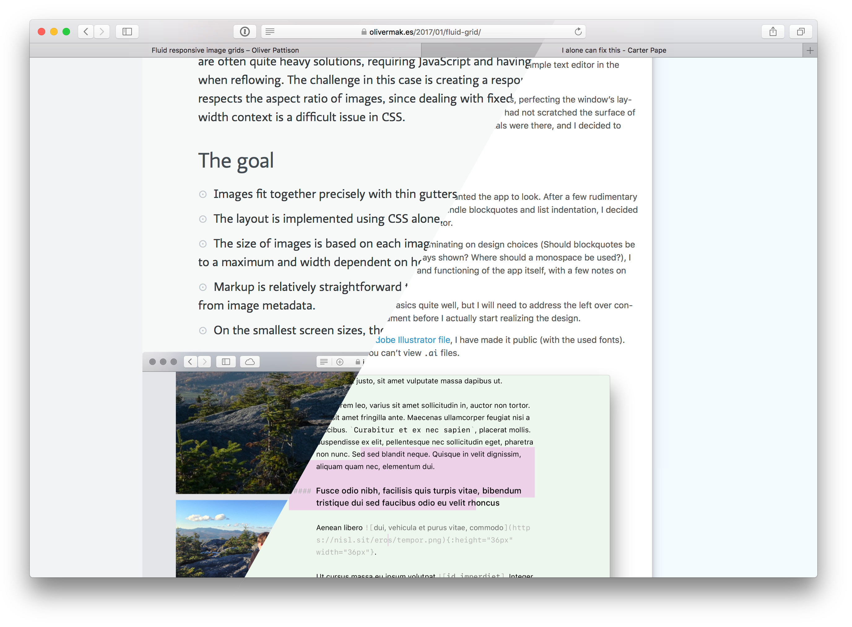
(left side of image: Oliver Pattison, CC BY-NC 4.0)
-
This is a backlink: ⤴︎
-
The ↩️ character was what appeared on my iPhone, but the ↩︎ character was what appeared on my computer, and I wanted the ↩︎ to appear on both. ⤴︎
-
I use the GitHub Pages gem to better emulate the environment in which my site is built on GitHub’s servers. It turns out that saved me a world of trouble because that plugin was the entity preventing my custom plugin from loading.
Had I not been using the GitHub Pages plugin, I may have ended up creating a solution to my emoji issue that worked on my local machine but failed to work on GitHub Pages. That would have been an incredibly frustrating problem to figure out, not in least part because I would have gone through the process of writing a functioning plugin only to discover I couldn’t use it. ⤴︎
-
as seen on his about page ⤴︎
-
Both the ⌅ and ↩︎ characters struck me as an imperfect way of communicating to the reader, “clicking this will take you back to where you had been reading before clicking this footnote.” Later, as I was browsing alternatives, I found the ⤴ arrow I am now using. It’s funny, though, because Wikipedia does not render that arrow (probably because their font doesn’t support it); I saw the character when I opened one of the linked Unicode Consortium
PDFs. ⤴︎ -
It turns out he organizes his site’s configuration files better than I organize mine, which hit me right in my ego as a programmer. However, his system isn’t perfect, so now I’m trying to improve my own config file organization system in a way that is compatible with GitHub Pages. ⤴︎
-
I already use the
capturetag in my code, but I use it primarily for case-based assignment of variables. Here’s the code I currently use to assign thedescriptionvariable for each page:{% capture description %} {% if page.description %} {{ page.description }} {% else %} {{ page.excerpt }} {% endif %} {% endcapture %} {% assign description = description | strip_html %}I suppose in retrospect this seems a quite limited manner of using this tag. ⤴︎